Image Guide
Nov 2, 2025
•
14 min read
Why Your Images Look Amateur (And How to Fix It in 5 Minutes)
Professional photographers have secrets. You're about to learn them.
You take a photo. It looks great on your phone. You upload it to Instagram, your website, or send it in an email. Suddenly it looks terrible—blurry, huge file size, wrong dimensions, or just... off.
The problem isn't your camera or your eye. It's that you're skipping the crucial step between capture and publish: image processing. Professional content creators never skip this. Amateurs always do.
This guide reveals the essential image processing techniques that separate professional-looking content from amateur hour. No Photoshop required. No expensive software. Just smart tools and 5 minutes of your time.
The 3 Image Sins Killing Your Content
Before we fix anything, let's identify what's actually wrong. Most image problems fall into three categories:
Sin #1: Massive file sizes. Your 6MB photo takes 10 seconds to load. Visitors bounce before they even see it. Google penalizes your site. Your email bounces back. All because you didn't compress.
Sin #2: Wrong dimensions. Your 4000×3000 pixel image gets displayed at 400×300 on your website. The browser downloads all that extra data for nothing. Waste of bandwidth. Waste of loading time.
Sin #3: Wrong format. PNG when you should use JPG. JPG when you should use WebP. Each format has a purpose. Using the wrong one costs you quality, file size, or both.
Fix these three sins, and your images instantly look more professional. Here's how.
Image Compression: The 80/20 Rule
Here's a truth bomb: you can usually reduce image file size by 70-80% without any visible quality loss. None. Your eyes can't tell the difference. But your website loading time sure can.
Why images are so large:
Modern cameras and phones capture images at ridiculous resolutions with maximum quality settings. A single iPhone photo can be 3-5MB. That's great for printing posters. It's terrible for the web.
How compression works:
Image compression removes redundant data your eyes don't notice anyway. Slight variations in pixel color. Extra detail in shadows. Information beyond what screens can display. Gone. And you won't miss it.
The sweet spot for different uses:
- Website headers/heroes: 200-400 KB max
- Blog post images: 100-200 KB
- Thumbnails: 20-50 KB
- Social media: 150-300 KB
- Email attachments: 500 KB-1 MB (if you must)
⚡
Speed Impact:
A 1-second delay in page load time = 7% reduction in conversions. Google found that 53% of mobile users abandon sites that take longer than 3 seconds to load. Image optimization is not optional. It's survival.
How to compress without losing quality:
Use our image compression tool. Drag your image in. The algorithm analyzes it and removes only the data you won't miss. You get a file that's 70-80% smaller but looks identical to the original.
Compare before and after. If you can spot the difference, dial back the compression slightly. But 95% of the time, maximum compression looks perfect.
Image Formats: The Right Tool for the Job
Not all image formats are created equal. Each one is designed for specific use cases. Use the wrong format and you're either wasting file size or sacrificing quality.
JPG/JPEG: The Workhorse
Best for: Photos, complex images with lots of colors, gradients, natural scenes
Pros: Small file sizes, universally supported, great for photos
Cons: Lossy compression (quality degrades with each save), no transparency support
When to use: 90% of your photos. Profile pictures. Blog post images. Product photos (unless you need transparency). Anything that's a photograph or has photographic elements.
PNG: The Quality Champion
Best for: Graphics with text, logos, images needing transparency, screenshots, simple illustrations
Pros: Lossless compression, supports transparency, perfect for text and sharp edges
Cons: Much larger file sizes than JPG for photos, not ideal for complex images
When to use: Logos, icons, images with text overlays, anything needing a transparent background, infographics, screenshots.
WebP: The Modern Marvel
Best for: Everything (if browser support isn't an issue)
Pros: 25-35% smaller than JPG with same quality, supports transparency like PNG, better than both
Cons: Not supported by older browsers (but that's becoming rare)
When to use: Modern websites where you control the platform. It's the future. But have JPG fallbacks for older browsers.
🎯
Quick Decision Guide
- Photo? → JPG (or WebP for modern sites)
- Logo or text? → PNG
- Need transparency? → PNG or WebP
- Simple illustration? → PNG or SVG
- Maximum quality? → PNG
- Maximum compression? → JPG or WebP
SVG: The Scalable Specialist
Best for: Vector graphics, logos, icons, illustrations
Pros: Infinitely scalable without quality loss, often tiny file sizes, can be styled with CSS
Cons: Only works for vector graphics, not photos
When to use: Logos, icons, simple illustrations. Anything that needs to scale perfectly from tiny to huge.
Image Resizing: Dimension Matters
Your phone captures 4000×3000 pixel photos. Your website displays them at 800×600. You're making visitors download 15× more data than necessary. This is image suicide.
The golden rule: Resize images to 2× the display size (for retina screens), no more.
Common display sizes:
- Full-width desktop hero: 1920×1080 max (2560×1440 for retina)
- Blog post featured image: 1200×630 (perfect for social sharing)
- In-article images: 800×600 or 1000×750
- Thumbnails: 300×300 or 400×400
- Social media profile: 400×400 (Instagram), 400×400 (Facebook)
- Social media posts: 1080×1080 (Instagram square), 1080×1350 (portrait)
Why resizing matters beyond file size:
Sure, smaller dimensions mean smaller files. But resizing also improves how your image looks. When browsers scale down huge images, they do it poorly. You get weird artifacts, slightly blurry results, wasted processing power.
When you resize properly before uploading, you control the quality. You can apply sharpening after resizing. You can optimize for the exact display size. The result looks better.
⚠️
Common Mistake:
Never upscale images. Going from 800×600 to 1600×1200 doesn't add detail—it just makes the image blurry. If you need a larger image, reshoot or find a higher-resolution source. Upscaling is always a bad idea.
Advanced Techniques for Pro Results
1. Cropping for Impact
Composition makes or breaks photos. But you don't need to be a photographer—you just need to crop smartly.
The rule of thirds: Imagine your image divided into 9 equal squares (3×3 grid). Place important elements along those grid lines or at intersections. Instant improvement.
Remove distractions: Crop out anything that doesn't serve the image's purpose. That random person in the background? Gone. Empty space adding nothing? Gone.
2. Aspect Ratio Optimization
Different platforms prefer different aspect ratios. Post a 16:9 image on Instagram and it gets cropped awkwardly. Know your targets:
- Instagram posts: 1:1 (square) or 4:5 (portrait)
- Instagram Stories: 9:16 (vertical)
- Facebook/Twitter posts: 1.91:1 (landscape)
- Website headers: 16:9 or 21:9 (ultrawide)
- Blog featured images: 1200×630 (1.91:1)
- YouTube thumbnails: 16:9
3. Color & Contrast Adjustments
Even without advanced editing, you can dramatically improve images by adjusting:
- Brightness: Dark images look unprofessional. Brighten (but don't overexpose)
- Contrast: Boost contrast slightly for punchier images
- Saturation: Increase 10-15% for more vibrant colors (don't go overboard)
- Sharpness: Add a touch after resizing to compensate for detail loss
🎨
The 5-Minute Professional Edit
- Crop to proper aspect ratio and remove distractions (1 min)
- Resize to 2× display size (30 seconds)
- Adjust brightness and contrast if needed (1 min)
- Sharpen slightly (30 seconds)
- Compress to target file size (1 min)
- Convert to optimal format (1 min)
That's it. 5 minutes. Professional results. Every time.
Platform-Specific Optimization
Different platforms have different requirements. Optimize for each:
For websites:
- Use WebP with JPG fallback
- Compress aggressively (quality 75-85)
- Resize to exact display dimensions × 2
- Lazy-load images below the fold
For email:
- Keep total email size under 100 KB (including all images)
- Each image should be 20-30 KB max
- Use JPG, never PNG (unless transparency is critical)
- Resize small—600px wide maximum
For social media:
- Match platform's recommended dimensions exactly
- Use high saturation and contrast (grabs attention)
- Keep file size under 1 MB (platforms compress anyway)
- Test how it looks in feed vs. expanded view
For print:
- 300 DPI minimum
- Actual print size dimensions (don't rely on scaling)
- Use CMYK color mode, not RGB
- Save as high-quality PNG or TIFF
The Bottom Line
Professional images aren't about expensive cameras or advanced Photoshop skills. They're about proper processing. The right size. The right format. The right compression.
These aren't optional nice-to-haves. In a world where attention spans are measured in seconds and page load times determine success, image optimization is mandatory.
The difference between amateur and professional content often comes down to these simple steps. Steps that take 5 minutes. Steps anyone can do.
Stop uploading raw images. Stop slowing down your site. Stop making your content look amateur.
Process your images properly. Every single time.
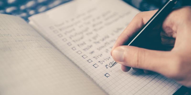
✅
Your Image Processing Checklist
- ☐ Crop to proper aspect ratio
- ☐ Resize to 2× display dimensions
- ☐ Adjust brightness/contrast if needed
- ☐ Sharpen slightly after resizing
- ☐ Choose the right format (JPG/PNG/WebP)
- ☐ Compress to target file size
- ☐ Test how it looks on actual devices
- ☐ Check file size before uploading